Homepage Design
The design priority for the main page was to provide a short summary of the site's purpose and features as well as guide users to the two main sections Elements and Compounds.
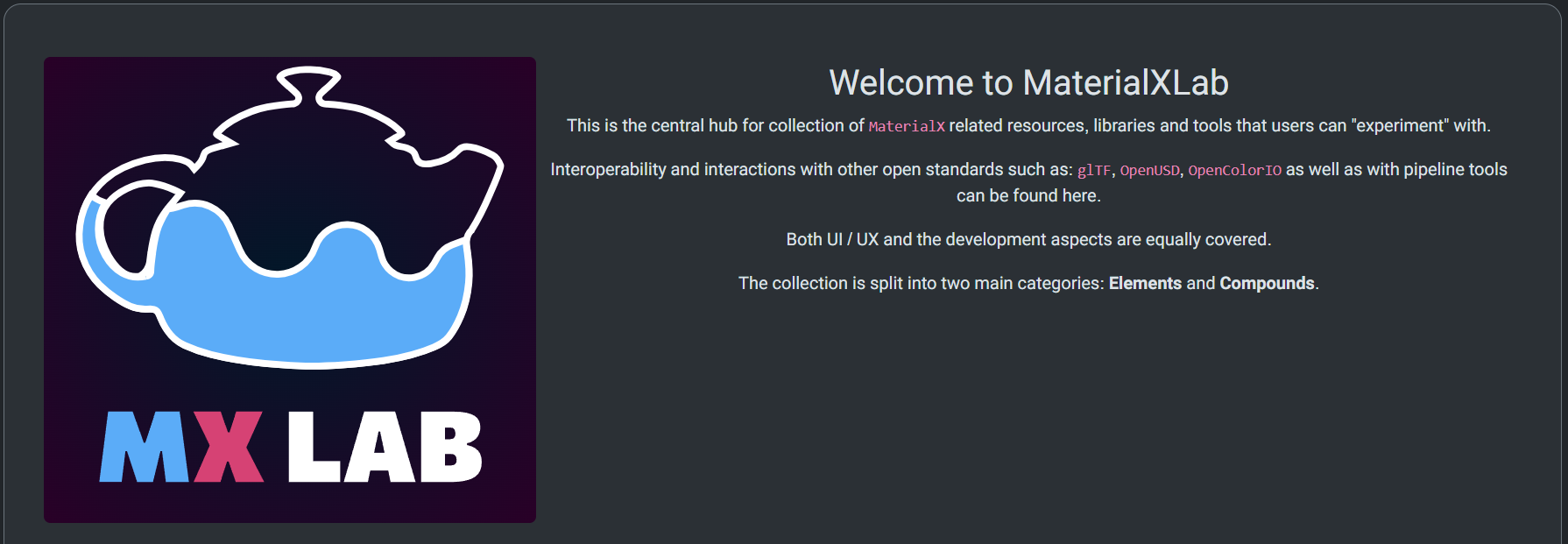
A large jumbotron (content box) was used for the overview to emphasize the site being a learning and utility resource for MaterialX. A large MX Lab logo is positioned to the left of the text to help establish branding imagery. The logo uses similar colors to the MaterialX logo with a stylized teapot to represent the various MaterialX utilities being used.
Below the description are two large panel "cards" for the elements and compound sections. These card blocks were made to span the width of the website for visual clarity. The responsive card blocks fill a single row on mobile devices for ease of navigation.
Design Theme
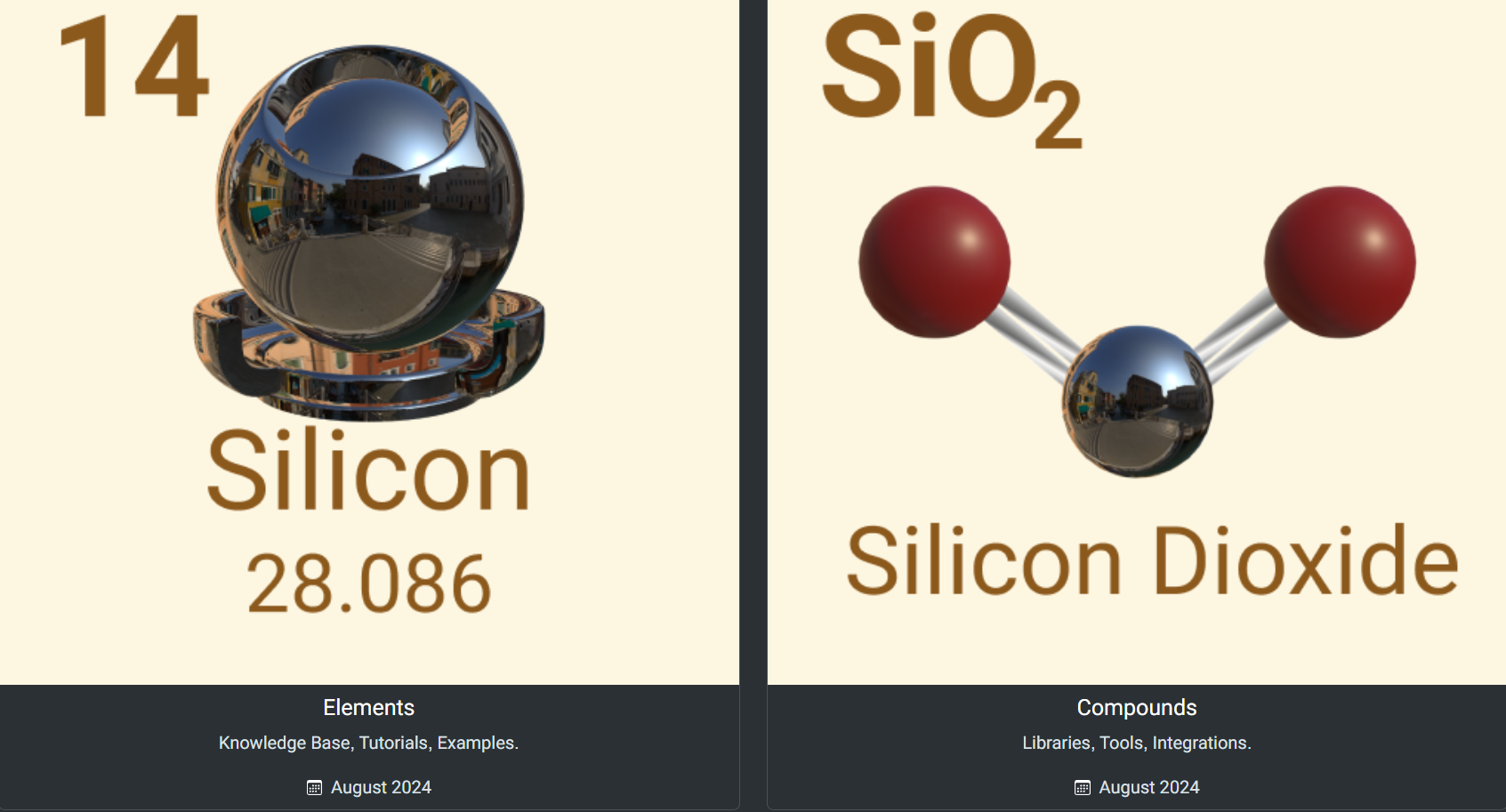
Content is themed around elements and compounds. Elements are pure substances. Compounds are substances made from multiple elements.
The elements section represents individual learning resources and the tutorial section for MaterialX. The compounds section is more complex in scope, being made up of interactive libraries and utilities.
Each card section's text and imagery is designed to emulate an element's layout in the periodic table. A shaderball model using a silicon shader is used in place of the element name. A model for silicon dioxide is used to represent the compound card. Each card has a text link located at the bottom and an image link when hovered over.
The visual design of elements is restrained, incorporating a monochrome color scheme. This is to draw users attention to important content, and provide a streamlined experience for new users.
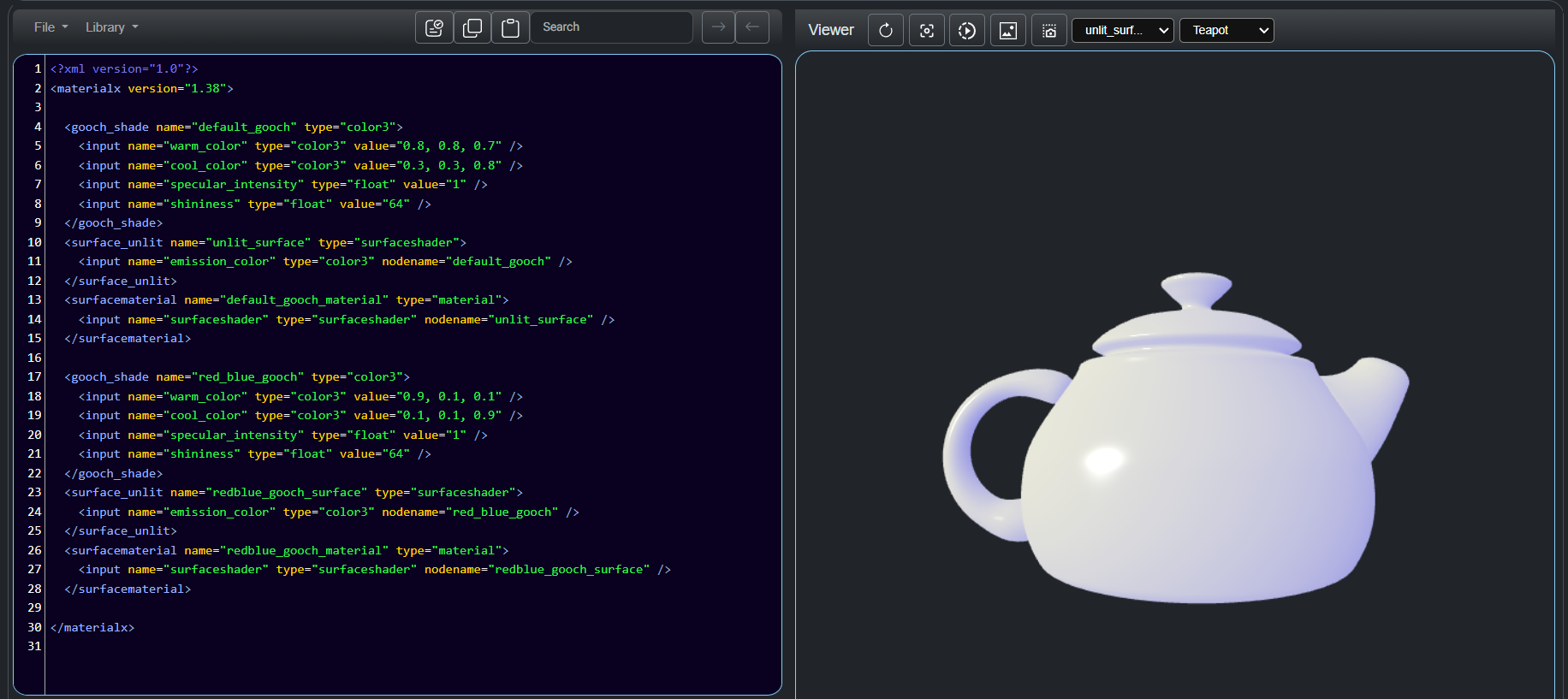
Another design priority was for the editable content to fit within a standard browser window frame. A maximum of two column layouts, collapsible tabs and minimal text content was used to accomplish this. This allows for users to have access to main tool features and recognize when changes are made when using utilities.
Content such as error handling sections are situated below the main utility section as their usage is infrequent.
Icons are used to represent standard functions such as copying or refreshing content. Each icon is designed to be a minimal decpiction of real-world actions such as taking a picture or rotating a model. Each icon is colored white to contrast with the monochrome background. Icon sizes are enlarged to be easily selectable on various devices. Icons with text tooltips are used in place of text description for immediate visual recognition, to provide a compact layout and for better readability on mobile phones.
Website Navigation

This website was designed to be responsive and streamlined in navigation. The navigation bar is always pinnned to the top so that users have easy access to the main sections: Home, Documentation, Tools and About Us.
Subheadings are limited to one layer for readability and precision when browsing on mobile devices. The home button is accessible at any time by clicking either the MX logo image or the Home link on the navigation bar.
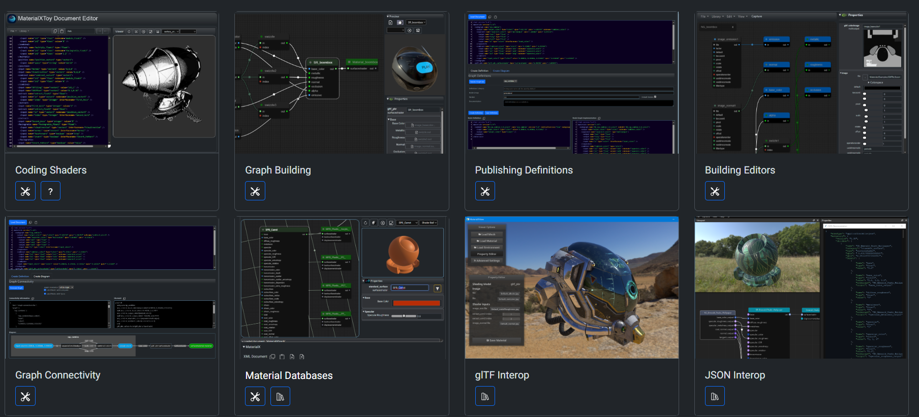
The two main sections elements and compounds contain tutorials/documentation and utilities. This stremalining enables users to immediately access the content they are looking for. Within the compound section each utility is shown as a "card" container with an image link, text link, category icon and usage documention text or video. This helps users immediately find the content they are looking for without needing to scroll through submenus or additional pages.
Tools Layout

For the utilities themselves each are color coded to describe various actions. For example, confirm buttons are blue, error messages are highlighted red and changes to the editor are highlighted in orange. This color coding is also used for the code editor. The aim here is to help onboard new users by using distinct visual indicators.

Another utility feature is that each section has an error handling or validation checker that will point out specific issues with the code by highlighting the text in red and showing an error message in the status window. Once the code is fixed the message window will show a confirmation message.
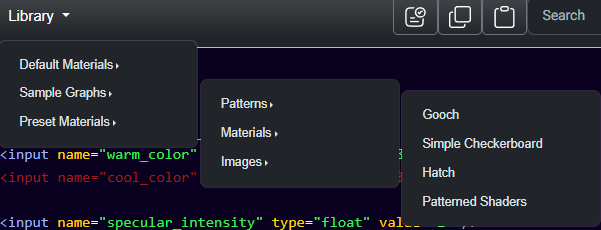
The final feature of each utility is to have prebuilt examples for models or graphs so that users have a basic understanding of editable features and components. These are easily accessible at any time from the features menu below located below the navigation bar.
Accesssibility
Various steps were taken to ensure that WCAG guidelines were met and that the website is accesssible for users on different platforms. Color accesssibility tests were done, and components were designed to adhere to contrast and text guidelines. Dark mode was enabled by default for those with difficulty viewing high contrast screens.
Users can also make editor sections non-destructible by adding text ksuch as readOnly = true to the web address. This was added to allow for content to be presented to others without accidental edits being made to a node graph or code editor.
