Website Design
The design focus was to present technical information in a consistent and concise format.
- Roboto was chosen as the font as it is easily legible on different screen formats and resolutions
- Tabs and buttons are blue and rounded in contrast to the plain background. Tabs are distinct and easily selectable.
- Areas are highlighted blue to represent currently selected sections
- Standard navigational options through a fixed navigation bar and a toggleable sidebar
- Maintaining WCAG accessiblity guidelines for color contrast between text and background colors
Shown below is the style guide and color accessiblity test for this website. The guide
outlines commonly used color variations, fonts, components and icons used throughout the
site.
The design focus for the homepage was to summarize each website section's purpose and to encourage users to navigate different areas of the site.
- A large gallery headline will draw user attention to featured sections. The gallery images will rotate at set intervals to keep users attention
- Featured articles will be situated below the introduction section and change frequently
- Website sections are located within a responsive container to make navigation easier on mobile or smaller screen sizes
Shown below is the current homepage. It is divided into the introduction, and website
sections. The gallery and featured articles will be addded at a later date.

The navigation bar is fixed to the top of the page so that is accessible at any time.
Navbar sections are split into areas such as learning content, reference information, tools, and design rationale. Sections have clickable dropdowns denoted by an downwards arrow to access sub categories.
The togglable sidebar was added to accomdate smaller screen or window sizes when reading about different node definitions. Users can click the sidebar button icon in the navbar to expand/minimize the sidebar.
The sidebar was created to make it easier to browse the many node definitions on the site.
Various layouts were experimented with such as collapsing the sidebar to the top of the page when the screen width decreases. This design was scrapped as the sidebar elements did not resize responsively.
The current sidebar is fixed to the left side and is togglable through a sidebar button in the navbar.
Features include:- Highlighted menu items are blue
- Two level menus organized by node groups -> individual node definitions
- The search bar at the top of the sidebar allows you to filter through different node groups. Users type into the search field and press enter to filter out node groups.
Shown below is the sidebar with the "adjustment" section open to browse its node
definitions.
To retrieve information following are important API classes:
- Document:
document api to get nodedefs va
getNodeDefs() - NodeDef: node definition
- Implementation: nodedef definition implementation
- NodeGraph >: node graph implementation
- Input: interface and node inputs for definitions and node graph implementation nodes
- Output: outputs for definitions, node graphs and nodes
Input and output ports can be inherited from a parent definition. Note that in
MaterialX
terminology, getting active information means to get inherited information.
Corresponding
APIs
having
an "Active" API variants (e.g. getActiveValueElements() vs
getValueElements()).
To get input and output attribute information the follow method is available:
Element::getAttribute(<attribute name>)
The general method to get value information (marked as 'value' in the template) is:
ValueElement::getValue()
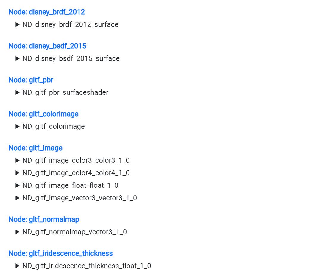
Originally all the node groups and their definitions was displayed at once. This made the website too slow to load as all of the content and images had to be loaded at the same time
The definitions were split by node group and put into seperate pages to make loading content faster on startup
The current node library groups are filterable in the search bar on the left sidebar
Shown below is an example of how the node library is organized by node groups and
associated node definitions.
Each node group contains node definitions as collapsible tabs denotated by a downwards arrow
Each node definitions is within a "card container
This card container template is used throughout containing:
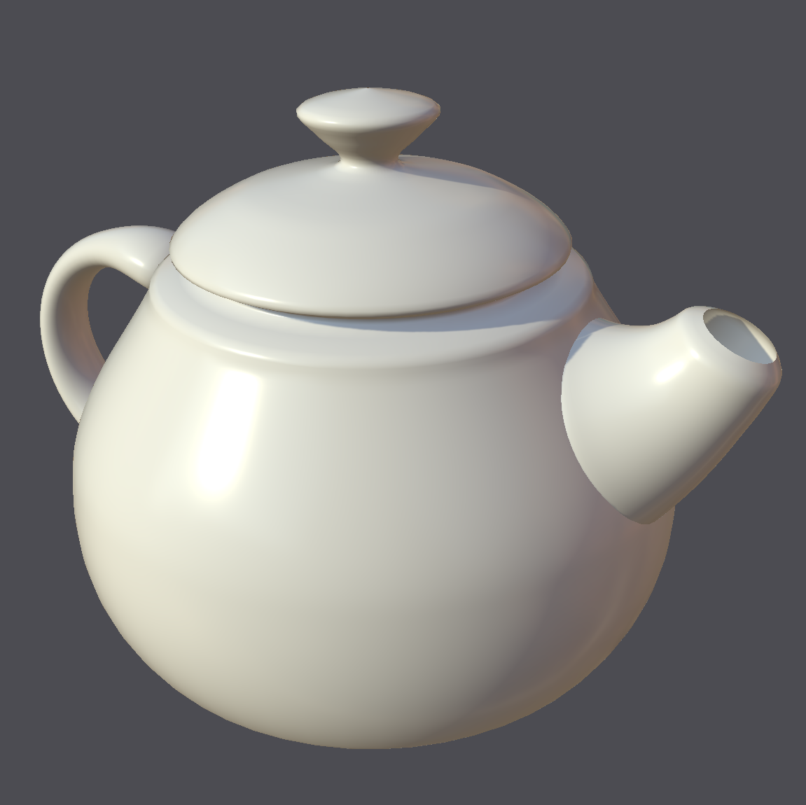
- Image preview of material
- Node graph and ability to copy the node graph to export as an image using the node graph utility
- Shows attribute values as a series of horizontal fields showing their value or output.
- Minimal spacing between tabs to improve the viewing experience on smaller screen sizes
Shown below is an example template card of a node definition and what the attributes
mean.
Name: 'name'
Type (The type section shows what the output is for the node)
Node Group (What node group is this node a part of.)
Version 'version' ( 'isdefault' ) Inherits From
Description:
Code Implementation/Node Graph Sections
Code implementation or node graph is displayed depending on the node definition.
Code implementation shows the language used and where the code is stored. The code can be found directly on this page or through a link to the referenced file. Function is the name of the function to look for within the code.
The node graph sections shows the graph for the node definition. Users can copy the code used to generate the graph and use the graph checker utility to generate and save their own node graph.
Code Implementation getImplementation()
Node Graph getImplementation()

Parameters: getValueElements()
ssdfjlsdkfj
The design focus with node graphs is to present information clearly and to make relationships between nodes easy to understand.
Node graphs are diagrams broken down into nodes, links, and properties. Nodes perform a
computation, links represent how data output of one node goes to the data input of a
different node. Data inputs and outputs are also commonly called data ''ports" or ''pins".
Properties are the additional attributes of a node or link. For example, one property of
a node can be its port data type such as color or boolean.
When designing node graphs, different colors are applied based on the property and symbol type for the node. Color usage is limited to reduce visual noise, making it easier for users to process the information.
Links (directional arrows) connecting the nodes can be color coded to be the same as the associated data port. For Mermaid diagrams, input port names are labels on links. In the checkerboard graph example below "in1" is a input data port for the "multiply" node.

The flow of information is all presented from left to right so that the information is easy to understand and view in a standard orientation.
Symbol usage was kept consistent throughout with blue ovals representing input nodes and green ovals output nodes. Rectangles represent a node, and orange diamonds a decision in the node graph.
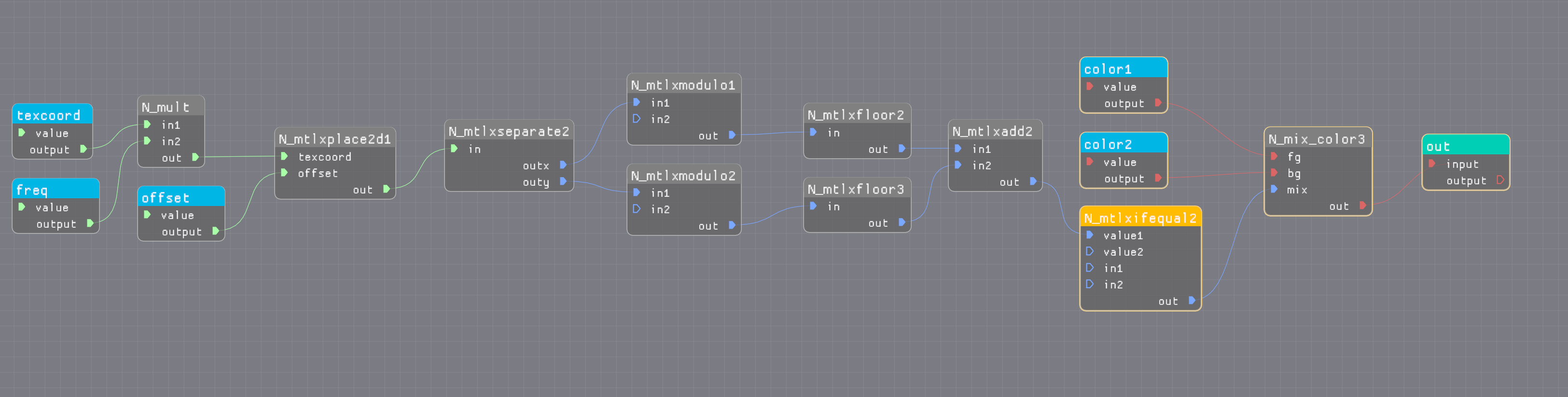
This example shows all ports as well as color coded links. The aim is to make the graphs similar to the above image.