Creating the Model Viewer
Table of Contents
1. Model Viewer Overview
The goal is to develop a web 3D model viewer that allows users to display and customize a variety of material, color and texture properties. Users would be able to save and load preset configurations to showcase their models to others. Each model would have labels that show material names, with material colors or textures linking to the associated commercial brands. Other priorities were to test the capabilites of generative AI in assisting in creating user interface components and for its capability in creating layouts.
2. First Model Viewer Layout
The model viewer uses the open source model-viewer to quickly load models in a webpage. The first material properties added were metalness, base color and roughness. These properties were used due to being easy to add to the user interface and to test modifying existing values stored in the model's glb file. The user interface was in its preliminary stages, with the material user interface overlapping the viewer and there being various text readability issues.
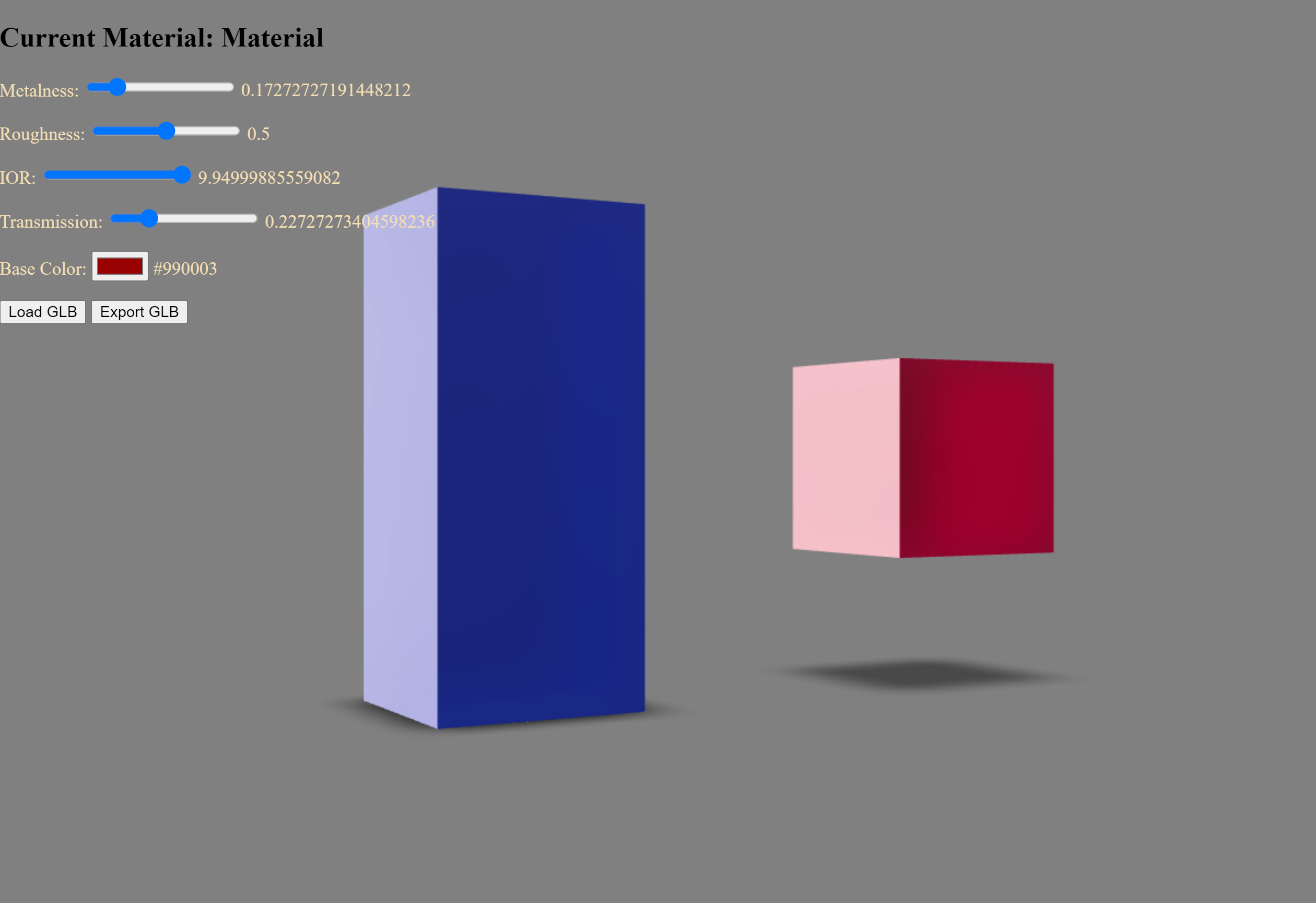
The cluttered material controls user interface overlaps the model viewer.
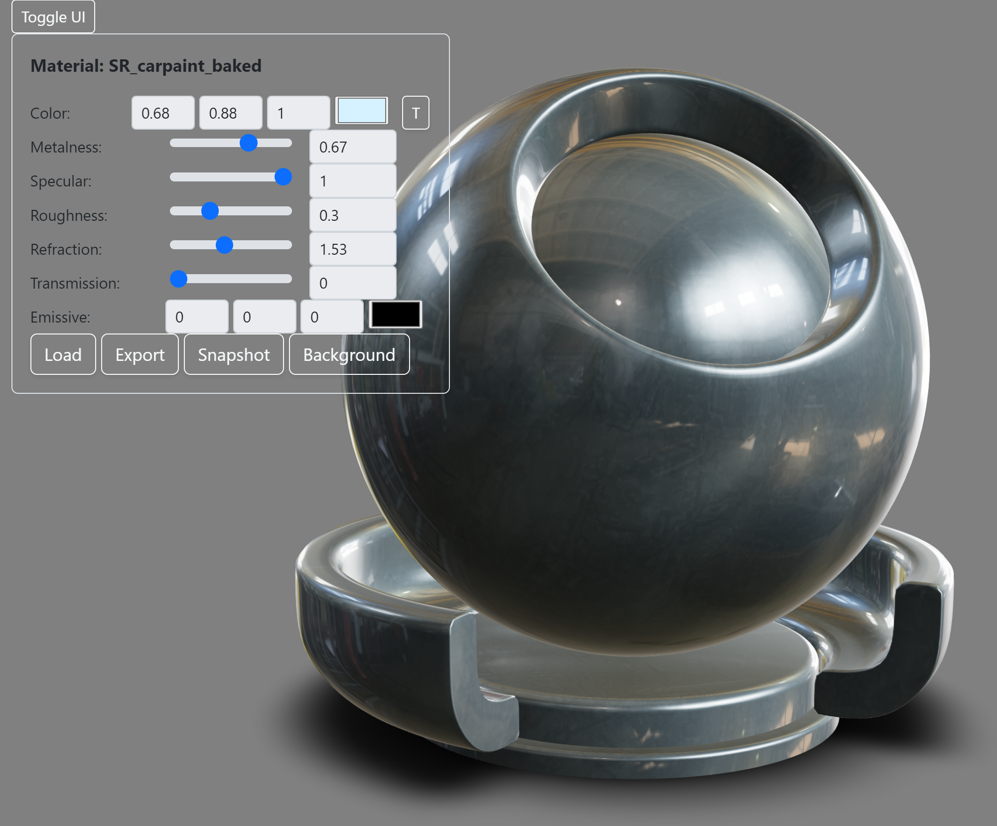
3. Adding a "Panel" User Interface
With the next iteration, additional material properties and model file options such as export/import/screen capture were added to the user interface.
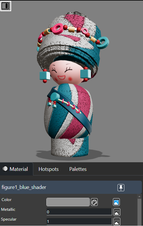
To create a more streamlined and responsive user interface, Bootstrap styling was used to create a "panel container" which contains all of a model's editable material properties, textures and colors.
Panel container for the material controls reduces the size of UI within the viewer
While this panel container reduced screen clutter, there were issues with form fields in the UI overlapping the model. When these fields were selected the material for the model would change making it difficult to edit the desired properties for model sections.
Adding additional fields to the user interface also resulted in more selection and screen space issues when using the model viewer.
To fix this issue of screen clutter, a "UI toggle button" was added to allow users to hide or show the panel container.
Using Alternative UI Toolkits
During devlopment, other toolkits were briefly experimented with to provide more ways to change model properties. For example, dat.gui was used to add model user interface controls. For this version, dat.gui usage was removed due to it interfering with the ability to edit the model-viewer user interface controls.
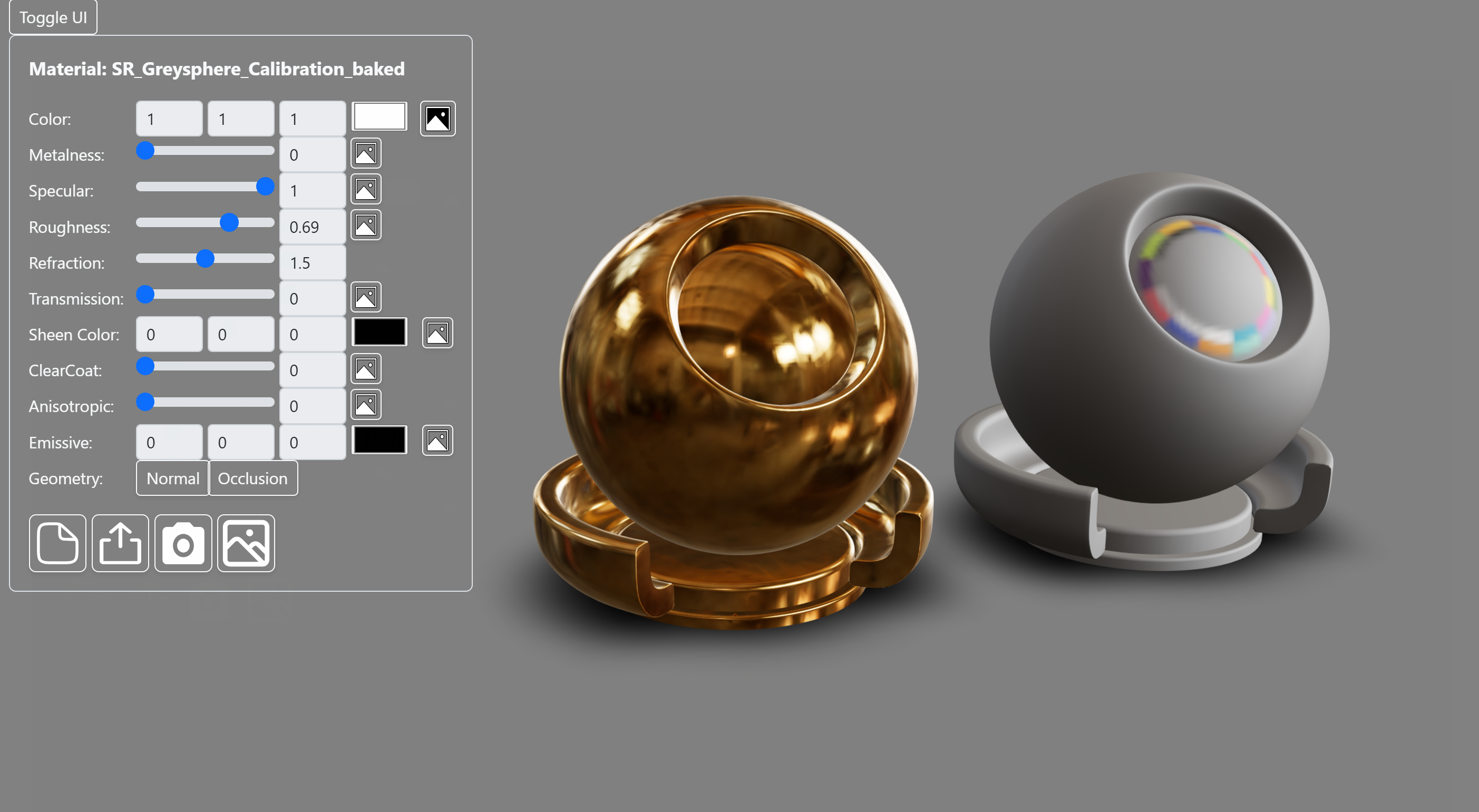
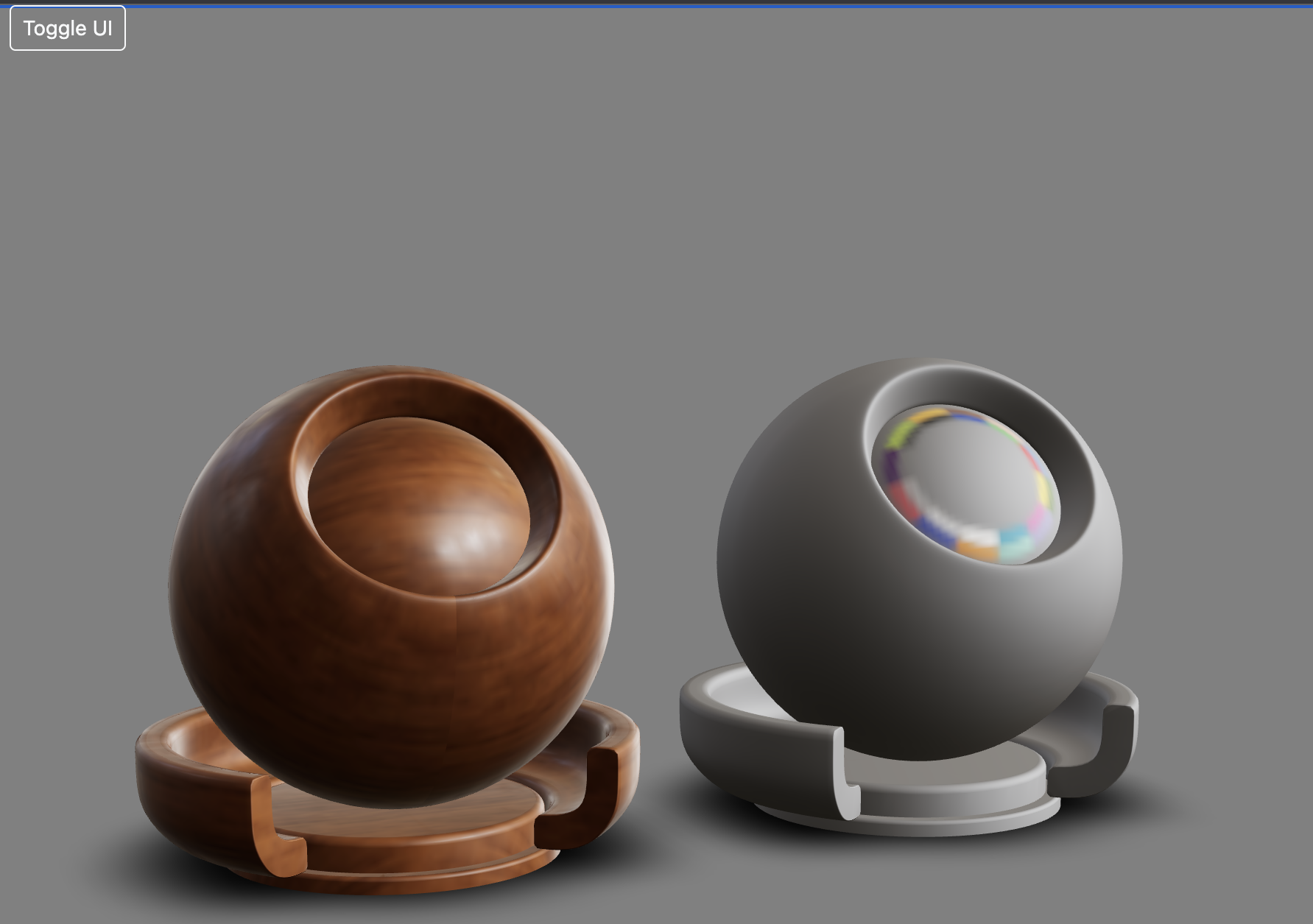
4. Using a Separate UI Container
To resolve the model selection problem the user inteface was placed in a separate container next to the viewer. SVG images were created to represent model export and texture loading icon options. These icons helped minimize the size of the layout and provide more visually understandable controls.
Further adjustments were made to improve readability and responsiveness of the user interface. The fonts and icons were scaled down and made responsive. A minimal amount of margin and padding was added to ensure that content within the container would not collapse onto each other on smaller screen dimensions. The material property sliders and the color picker were minimized in size to accommodate mobile screens.
| Full Width | iPhone 6 Preview |
|---|---|
 |
 |
Camera Controls
In the next iteration options were added for users to be able to freely rotate, scale and pan models. User interface model manipulation features include a camera reset tool. Clicking this UI button resets the camera view to its original position.
Hotspots
The next iteration of the model viewer was creating seperate tabbed menus for the existing "materials" menu and the new "hotspot" menu. Tabbed menus were used to reduce the amount of controls per row and to categorize editable options for users.
Hotspots are labels for the selected materials of a model. When clicked the camera position shifts to highlight that section of the model. These labels make it easier for users to identify modifiable model parts.
The goal was to make each hotspot label easy to understand and edit. Hotspot labels are shown or hid using a hotspot button toggle in the "Hotspots" tabbed group. Toggling this button allows you to add material labels by clicking parts of the model. Each label is shown as a seperate row in the "Hotspots" tab. Each label displays the material's name and can be hidden or deleted.
After a couple of revisions the ability to clear all labels was added to improve visibility in the model viewer. Users can also save/load hotspots which stores the camera position and material name for the hotspot labels.
To improve the viewing experience on mobile devices, the list of hotspots becomes a scrollable menu if there are too many entries, with the label row resizing responsively to fit the smaller screen.
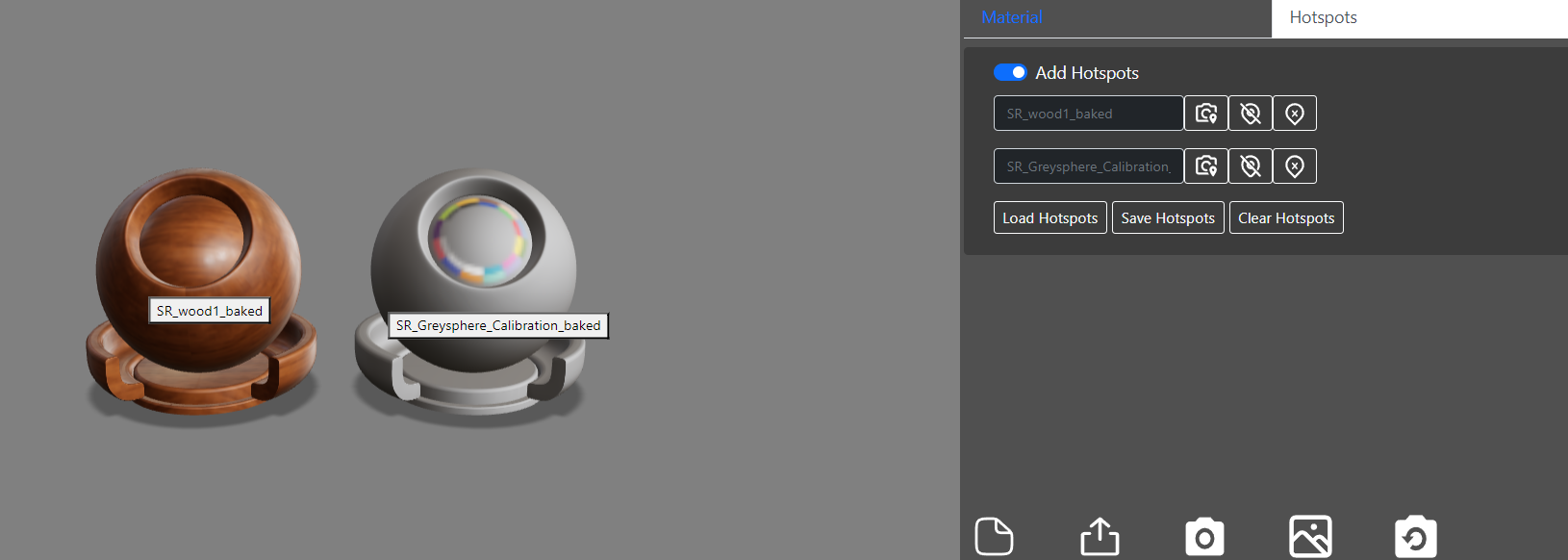
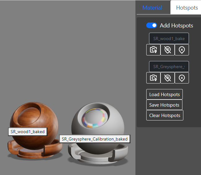
Clicking the toggle enable hotspots to be shown. Hotspots can be removed, focused on, hidden or be cleared completely, The hotspot ui collapses into multiple rows to fit better on mobile devices
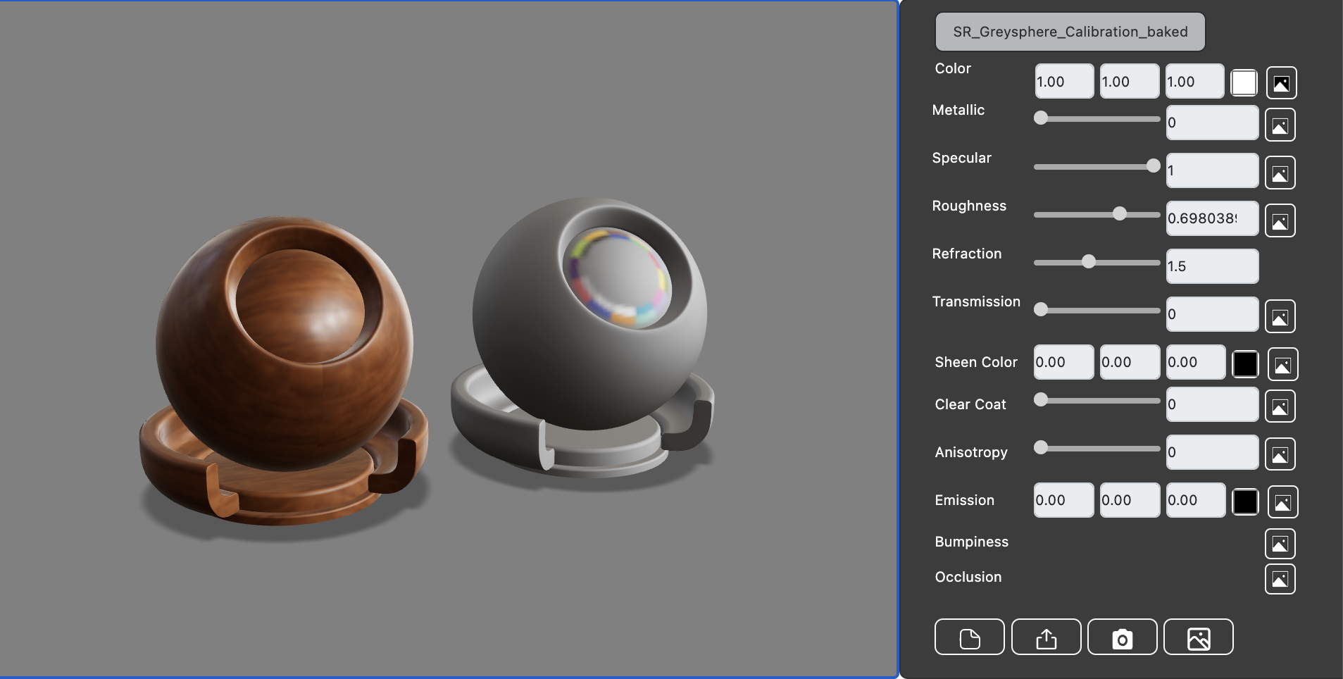
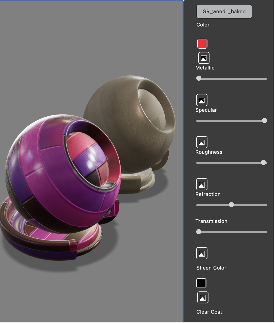
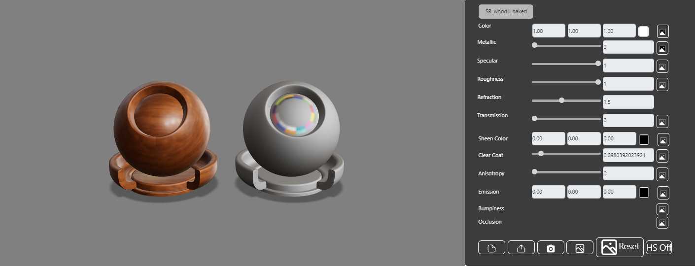
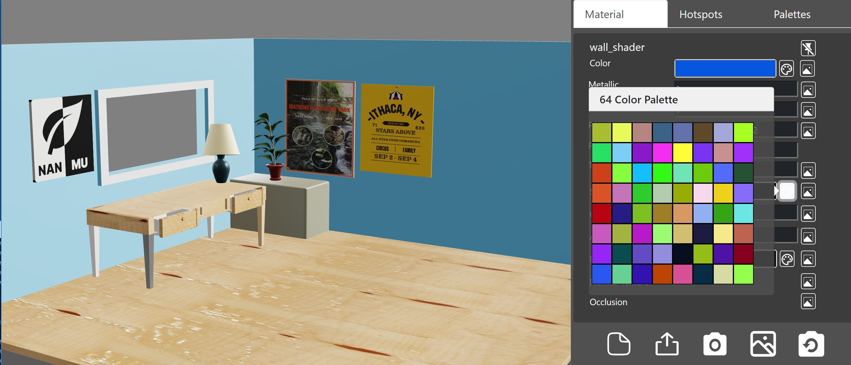
Color Material Picker
The last main feature to incorporate was having a comprehensive material color editor. Priority was placed on providing options for users to load in custom color palettes and modify material colors using reference material such as commercial paint swatches.
Initially, there was some difficulty implementing the color palette picker into the model viewer. The grid of colors was not drawn properly, and it was difficult to read the color information from file and reperent it as a color grid. This was due to mixed code from old versions of bootstrap and the string in the JSON file not being read in due to being enclosed in double quotes. Other coding specifics were setting sanitize to false to enable the color grid to be displayed.
This was remedied by using a Boostrap popper menu. This popper displays when an interactable element (the color swatch) is clicked. The json color file is first loaded into memory by clicking the load color palette button. When the swatch is clicked the color palette colors and name is shown. Clicking a color in the palette grid updates the swatch color as well as the material color.
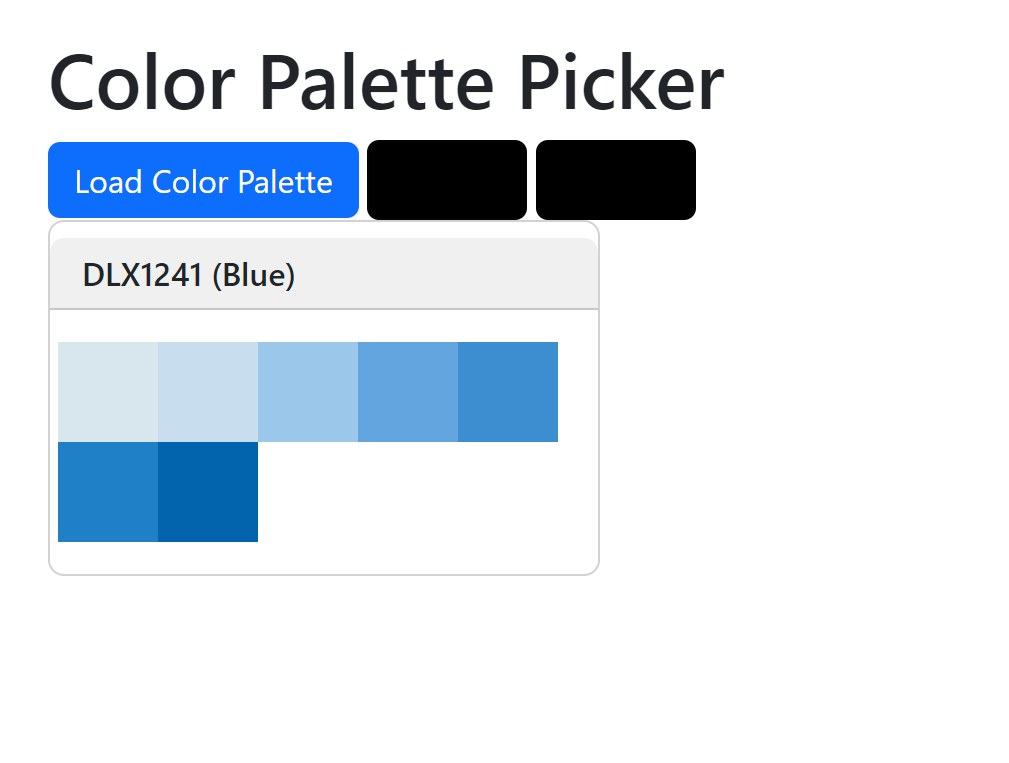
Users click the color swatch to open the color palette popper. Clicking a color changes the swatch color and the material color
Color Palette User Interface In the Model Viewer
For the first working prototype the main feature incorporated was the color palette section. An additional tabbed area was added to the user interface that allows users to load in color palette files (json). Color palettes are displayed as responsive rows similar to hotspot labels. The code from the test color material picker was adapted for this section.
Color of a material can only be modified in the materials tab. The palette section is for restricting the custom color palette to the selected option.
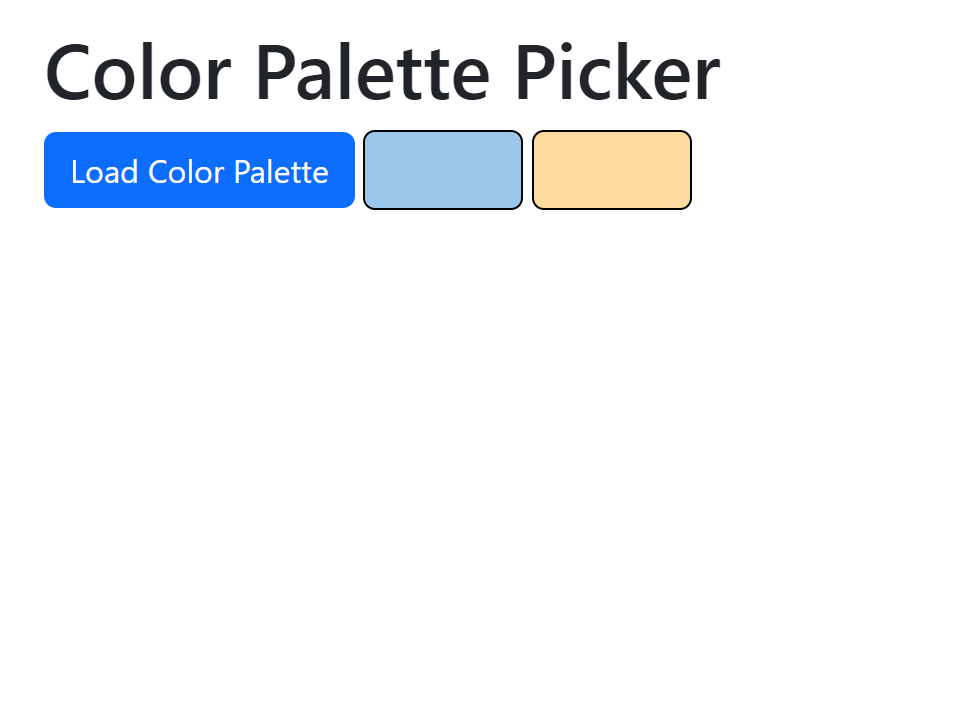
Another usability consideration was the ability to use the default color picker instead of a custom color palette. Thus a deselect palette button was added to the palette selection.
File Loading Improvements
Additional usability improvements include an alternative method to load in model files. Users can drag model files (glb) into the model viewer window to load in files instead of selecting the model file by clicking the load model icon. The screen will briefly highlight a colored border around the viewer to show that the model has been loaded.
File loading options were also added for model environments. Due to a bug with model viewer new environments can only be added by dragging and dropping hdr files into the model viewer window. The screen will briefly highlight and the new environment will be loaded in.
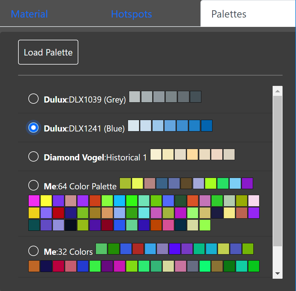
Users can load in their own color palettes. Selecting a color palette restricts the colors that can be selected in the material color swatch to that specific palette.
Version 1
For this prototype changes were made to the palette section, and the user interface organization. During testing users found the process to use a custom palette to adjust material colors confusing. Users were unsure whether they were editing the model's default color palette or the custom palette.
A seperate swatch was made for the palette colors and positioned next to the regular color swatch. Once a palette is loaded in the palette section, clicking the palette icon in the materials section shows the colors available.
Some users expressed fustration with the viewing experience on mobile with the user interface being difficult to parse and to press certain buttons. Accordingly the user interface was center aligned and the icon bar collapsed to a single row per icon on mobile devices. This provides more interactable screen space to view and adjust model properties.
Users can load in their own color palettes. The color palette is now a seperate selectable icon that shows modifiable colors in a grid menu overlay (popper).
Version 1.1
For the prototype the aim was to improve the material property editor interface for mobile usage
(small horizontal screen dimensions).
The key changes are listed below:
| Description | Preview |
|---|---|
| Making all elements within a row collapsible into a single row for small horizontal screen dimensions. This included removing any specific responsive column wrapping (based on screen size) as well as adjusting the layouts padding and margins. | 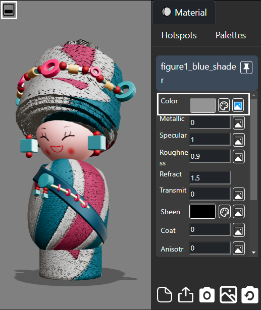
|
Adding the ability to have the tabbed panel collapse either beneath the model viewer or beside it for either mobile devices or desktop. A toggle was overlaid (
 , ,  ) within the model viewer was added to allow manual switching the panel position. ) within the model viewer was added to allow manual switching the panel position.
| 
|