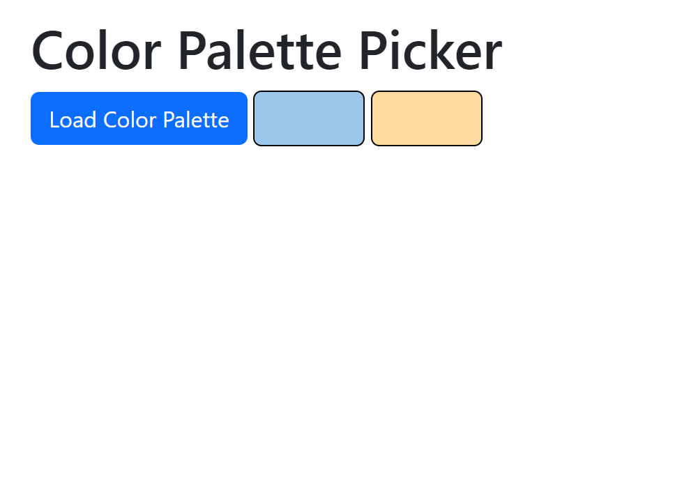
Color Palette Picker Prototyping
Description
The following is a sample page to test out using Bootstrap "popovers" (data-bs-toggle="popover"). The version of Bootstrap used is v5.3.0.
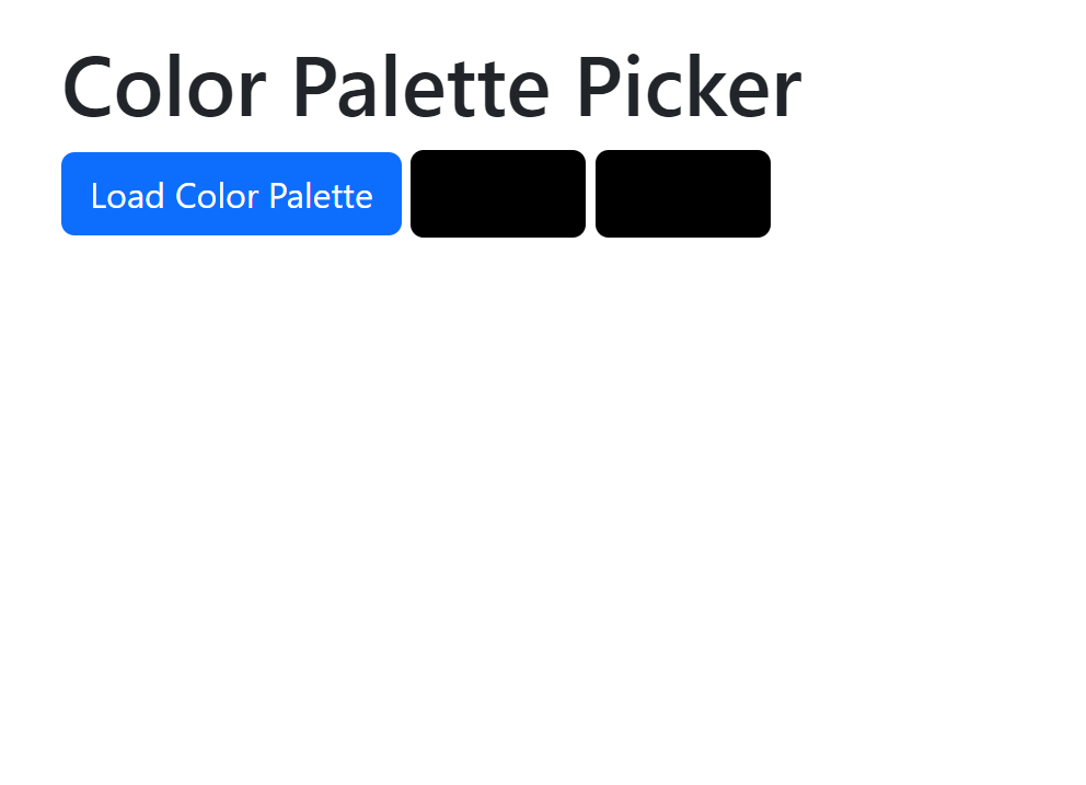
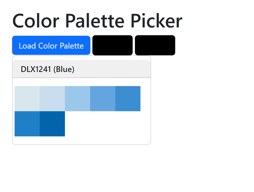
- Clicking on the "Load Color Palette" button loads a JSON file containing a color palette.
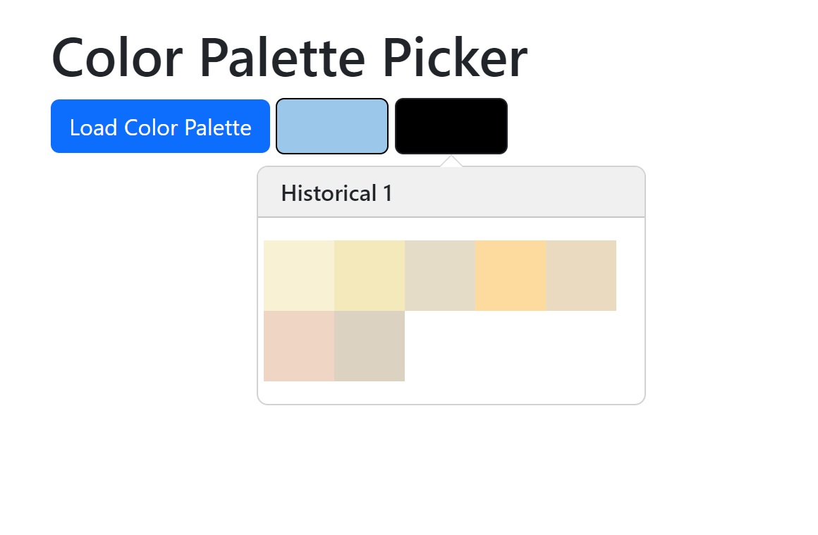
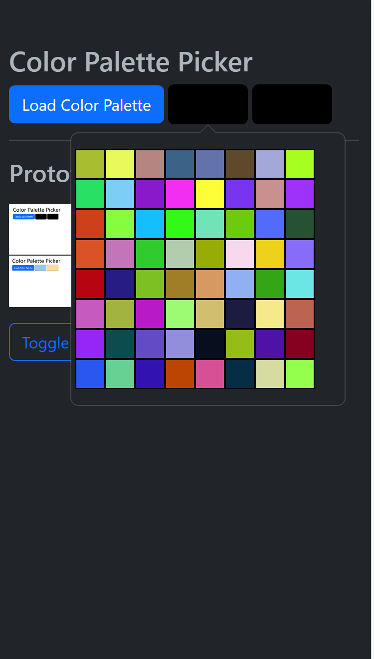
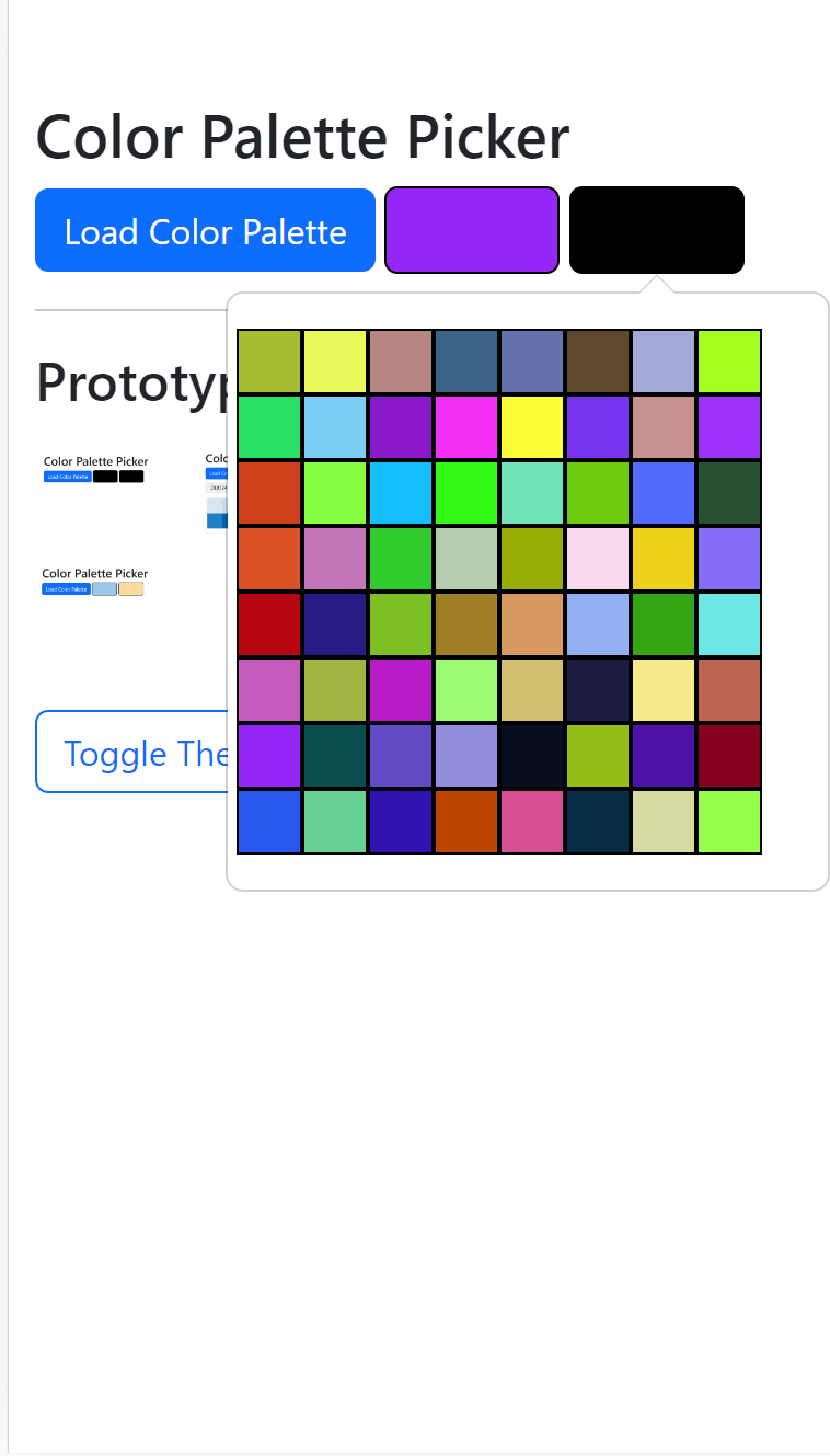
- Clicking on a color swatch brings up the palette as a popover.
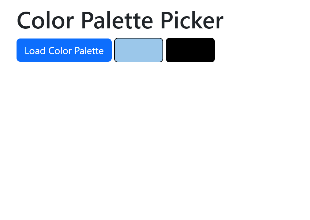
- Selecting a palette item updates the corresponding color swatch.
- Each swatch can have different colors assigned using a popover
Implementation
Two color swatches are added to test the modularity of the popover.
The the code was partially generated initially generated with ChatGPT but it could never successfully generate the correct code. Instead the Bootstrap documentation was used to write bespoke code along with some assistance from Github Co-Pilot for things like code completion and Bootstrap class documentation.
The "dark" vs "light" mode toggle was also added using ChatGPT generated code.
Issues that had to be resolved included:
- Deriving an appropriate formatted string to used as the popover HTML. Note that the HTML was custom written.
- Avoiding HTML "santization" which results in invalid HTML being created
- Setting the correct parameters for popover creation for a trigger. Some modes do not work properly (such as "hover" mode).
Interactive Test
Appendix
Prototype Images
 Early ChatGPT + custom code prototype.