Defining Target Audience
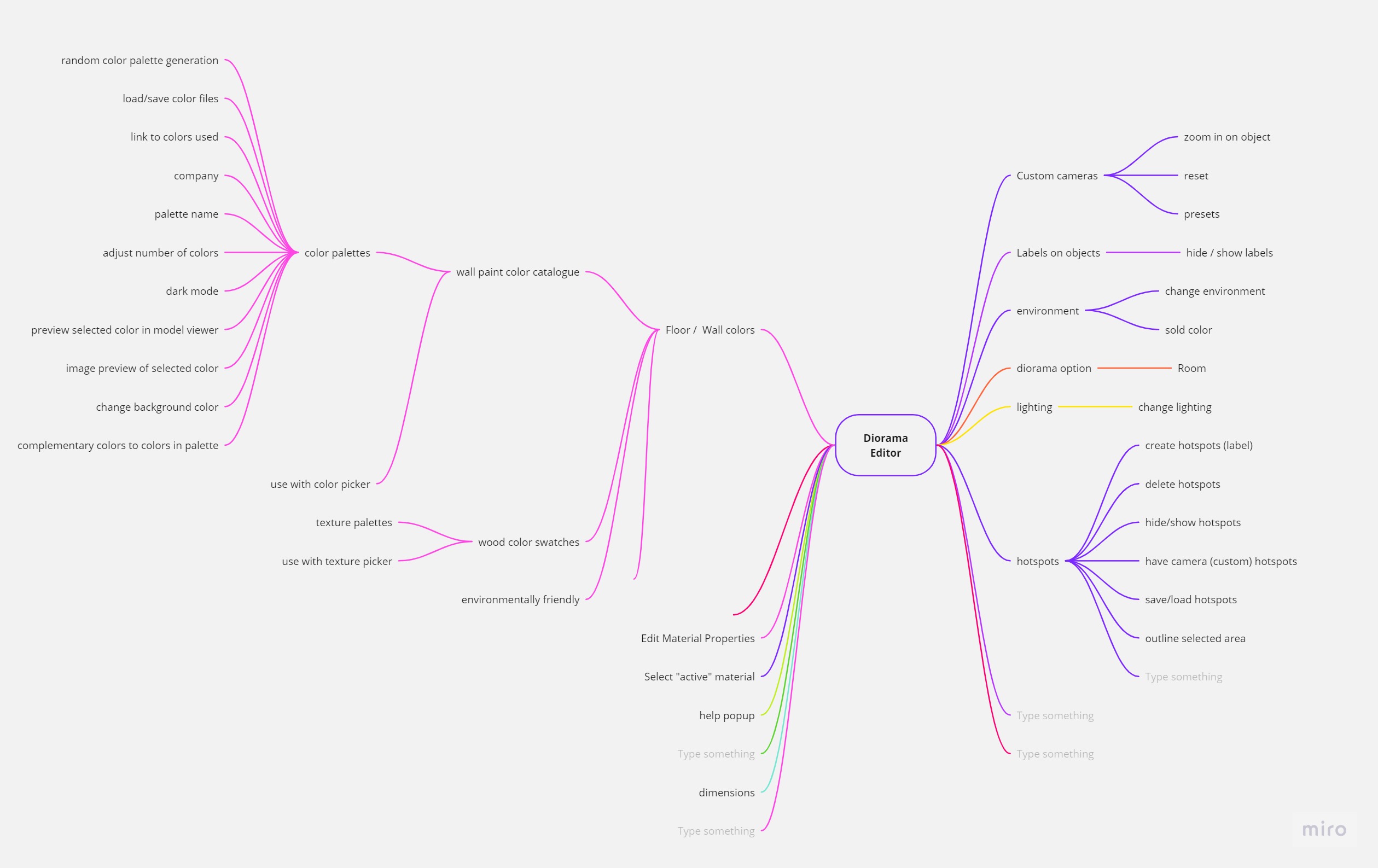
Initially a mind map was created to plan out the scope of the project and determine the main features that the model editor could have. The plan was for there to be a material color editor and the funcionality to save and load models. The mindmap was expanded further over time as new features were added to the model editor such as custom color palettes and material labels.
Next a series of surveys and interviews were conducted to determine target audiences and issues with current model editors. This user research revealed that designers, engineers and artists were the primary audience. In addition, respondents expressed the desire for viewing color variations for their models as well as the file import/export options.

Mind map for planned features and interactions possible within the model viewer
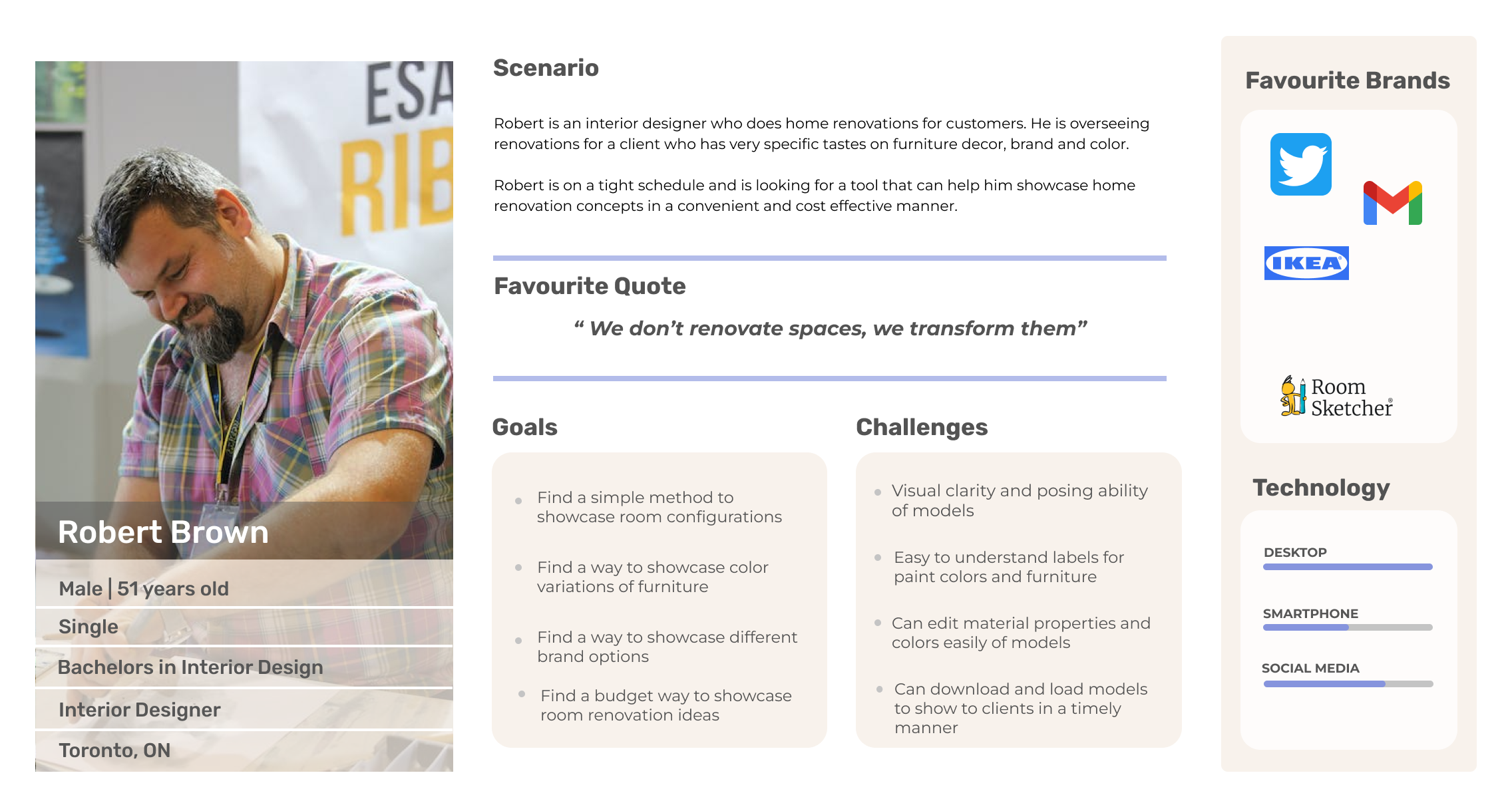
A user persona was then created based on the qualitative research data. Robert is an interior designer who does home renovations for customers. Robert is completing renovations for a client who has very specific tastes on furniture type, brand and color. Robert is on a tight schedule and is looking for a tool that can help him showcase home renovation concepts in a convenient and cost effective manner.
Thus for the model viewer focus was placed on designing a model viewer that is efficient to use, and offers a variety of customziation options for users to showcase to others.

User persona for Robert, an interior designer searching for a tool to showcase room configurations to a client.
Usability Testing
Prototypes were tested by having users alter various components of a model in the viewer and having them state what they found difficult to use or what could be improved.
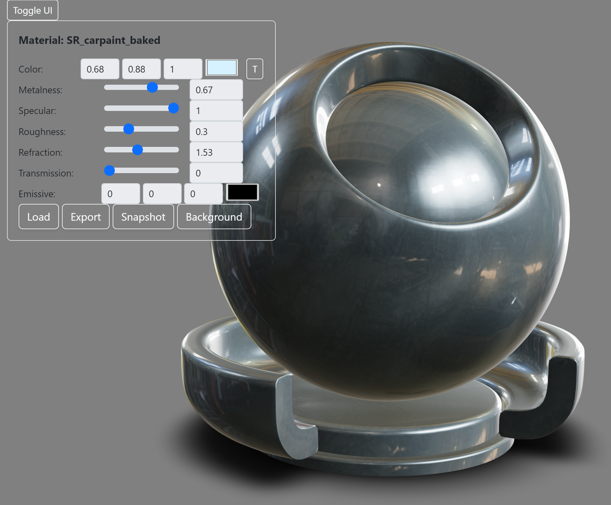
For the early versions clarity of user interface controls and speed of completing processes like changing material values was tested.
For later versions the process to load in custom color palettes, assign hotspot labels and save and export model scenes was tested.
These user tests helped to create a responsive layout, add a features toolbar and to streamline the information displays.

Following user testing the user interface was moved to a seperate container due to issues with model selection and clarity.
In addition to user testing, A/B testing was done to help determine which version of a user interface to use. This was done for variations of the color palette popper display as well as the layout of the hotspot labels within the tabbed menu.
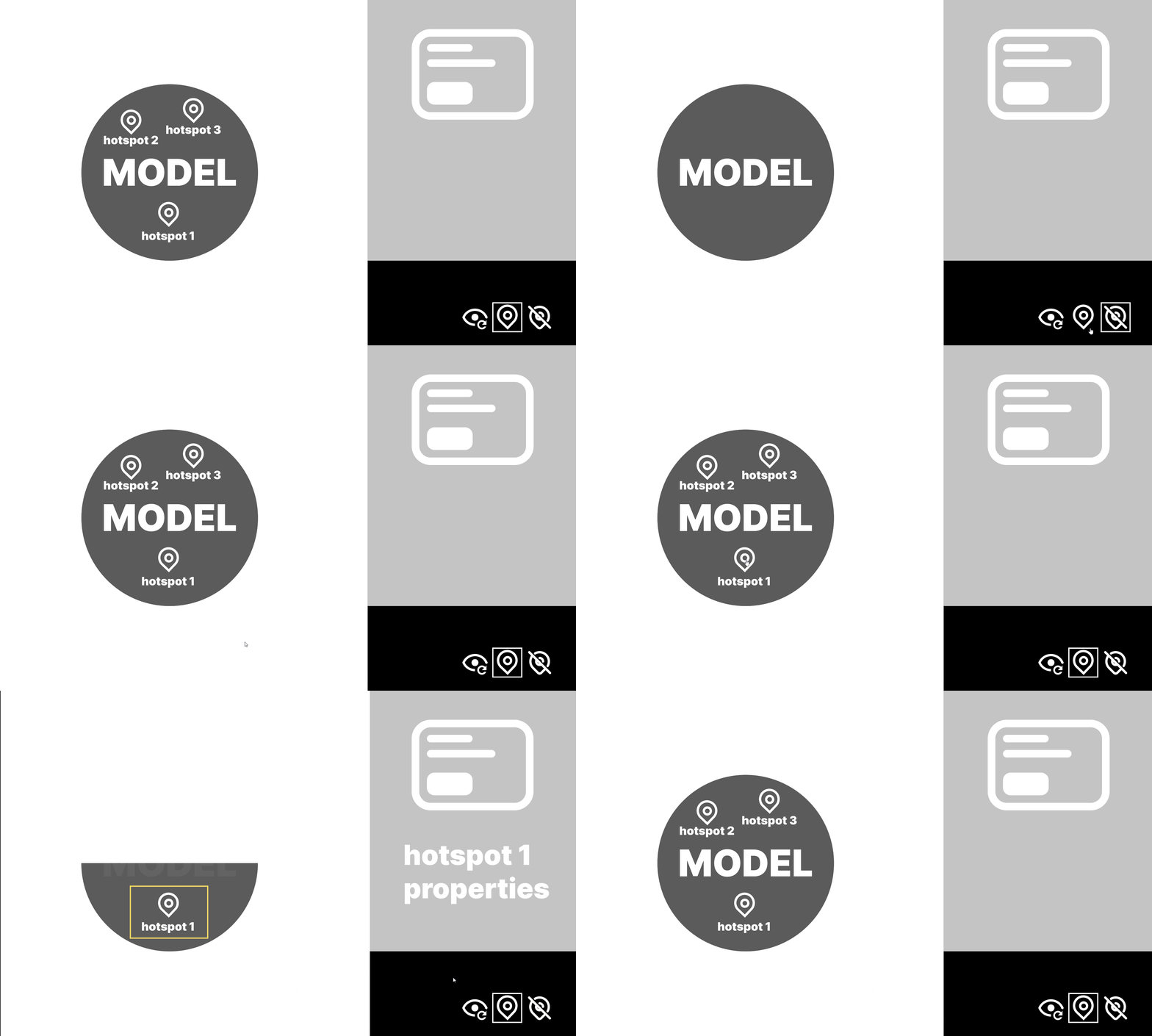
Another usability test was done using a Figma demo to determine how to display hotspots on a model. Users were tasked with hiding, showing and going back to the original model view. This testing helped determine the need for user interface controls to reorient the camera closer to the hotspot label as well as the ability to remove individual hotspots or clear all hotspots from view.

Prototype demo to test how hotspots are displayed and hidden. Following feedback hotspot options were moved to a seperate tab in the UI.